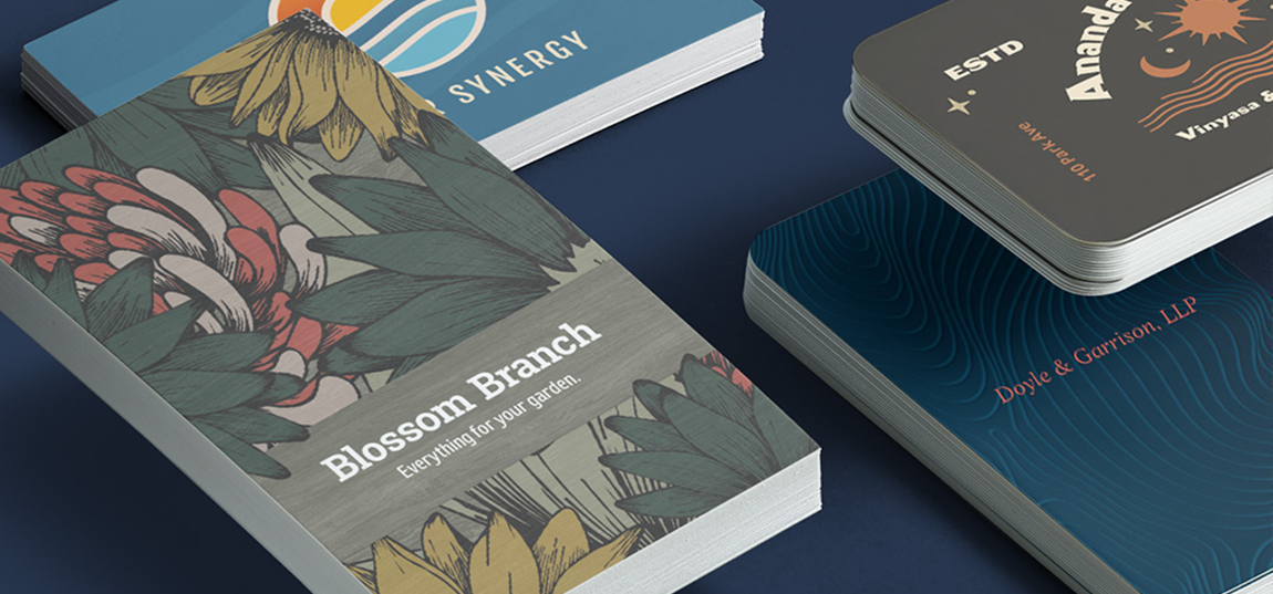
Picture this: You open a business card template and type your small business name. It looks tiny against the white background, so you increase the font size. Now, you explore the font menu to see how it looks in different typeface styles. Before you know it, you’re scrolling through the (seemingly) endless list of fonts, more indecisive than ever.
With thousands of types of business cards and font styles to choose from, selecting the typographic style that will define your business presents a daunting challenge. The fonts you use on your business card have two main jobs – they should attract attention, and be easy to read.
Here, we’ll dive into the importance of typography in design, as well as uncover the best fonts for business cards. And don’t worry – it’s not as daunting as you think it is! We’re here to help guide you through the different types of fonts, how to combine different styles and the ideal business card font size.
Types of fonts: serif & sans-serif
What is a sans-serif font?
Sans-serif fonts are also used for digital display text. On lower-resolution displays, fine details like serifs can disappear or appear too large. So, keep sans-serif fonts in mind as you align your online and offline presence.
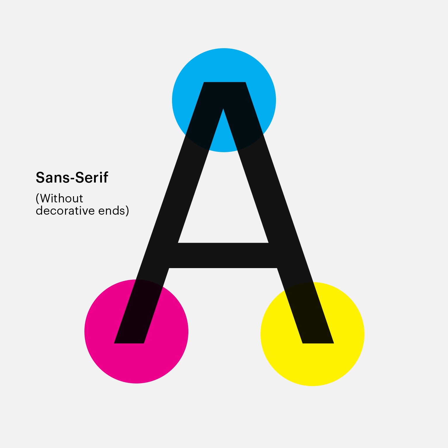
If you were wondering, the term ‘sans-serif’ comes from the French word ‘sans,’ meaning ‘without,’ while ‘serif’ is believed to have Dutch origin – ‘schreef’ means ‘line.’ Fancy, right?
What is a serif font?
Serifs originate from carved inscriptions found engraved on historic buildings, bridges and gravestones. This historical association makes serif fonts ideal if you want to give your brand a traditional or well-established look
Due to tradition and perceived readability, serif typefaces are commonly used in lengthy manuscripts, books, newspapers and magazines. Some believe that readability and reading speed of long passages is improved with serif fonts, as serifs help the eye travel across a line. Others believe that serif fonts improve readability since that’s what we’re most used to reading.
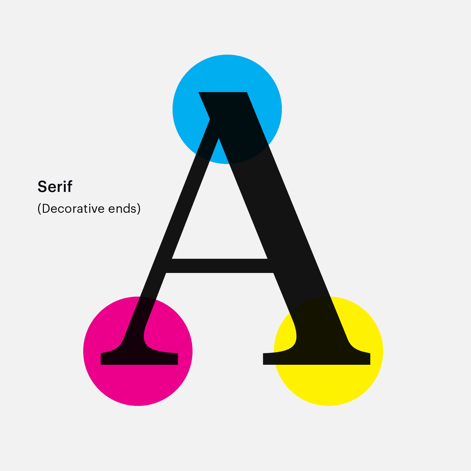
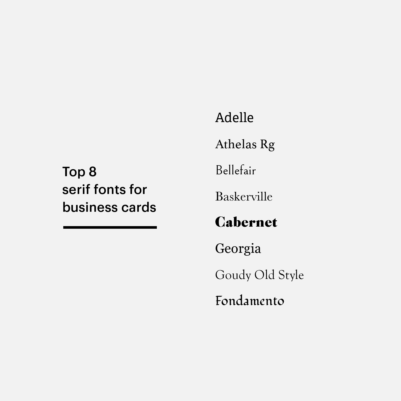
Tip: If you want to add embossed gloss to a serif font on your business card, only do it on the largest text field – like the name of your small business.
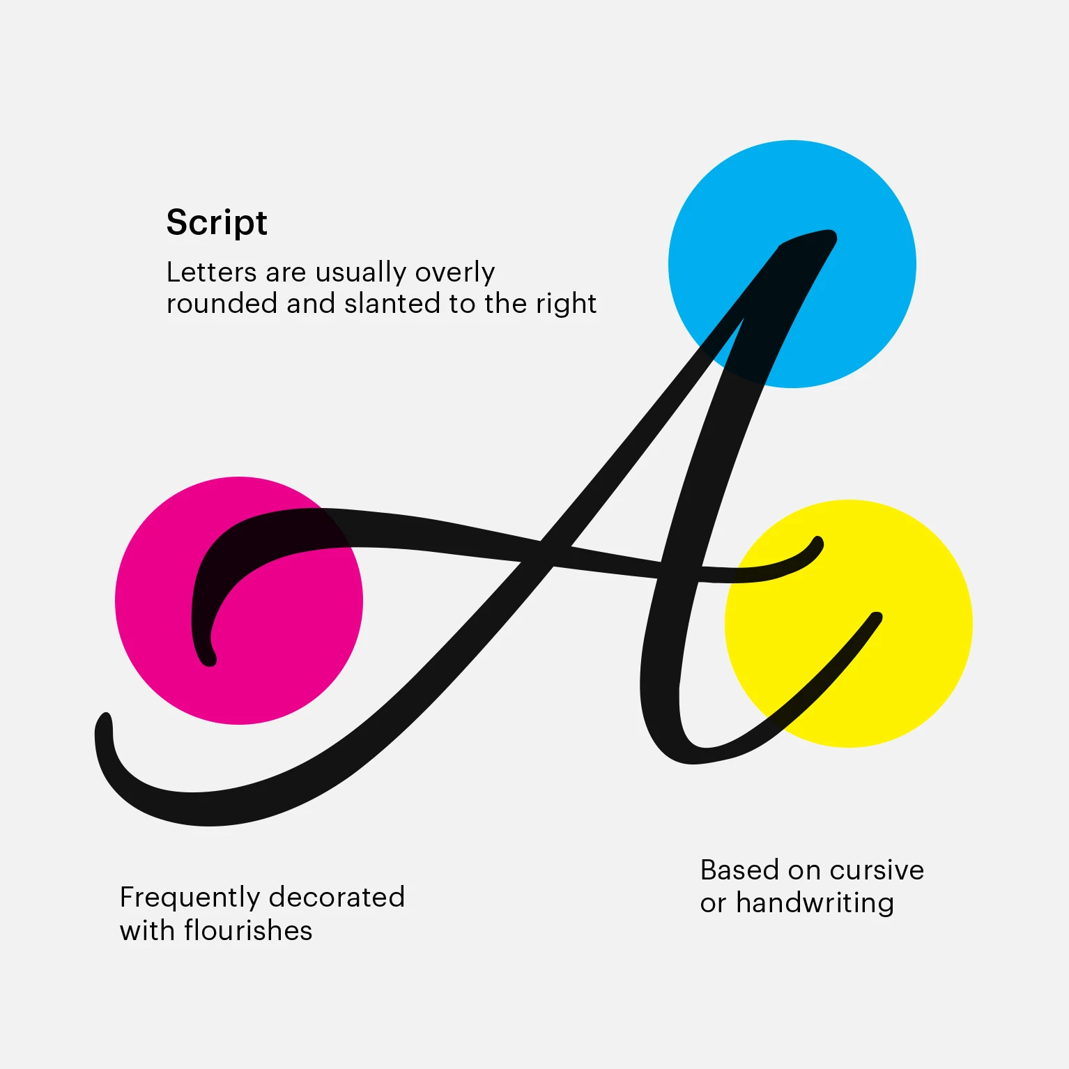
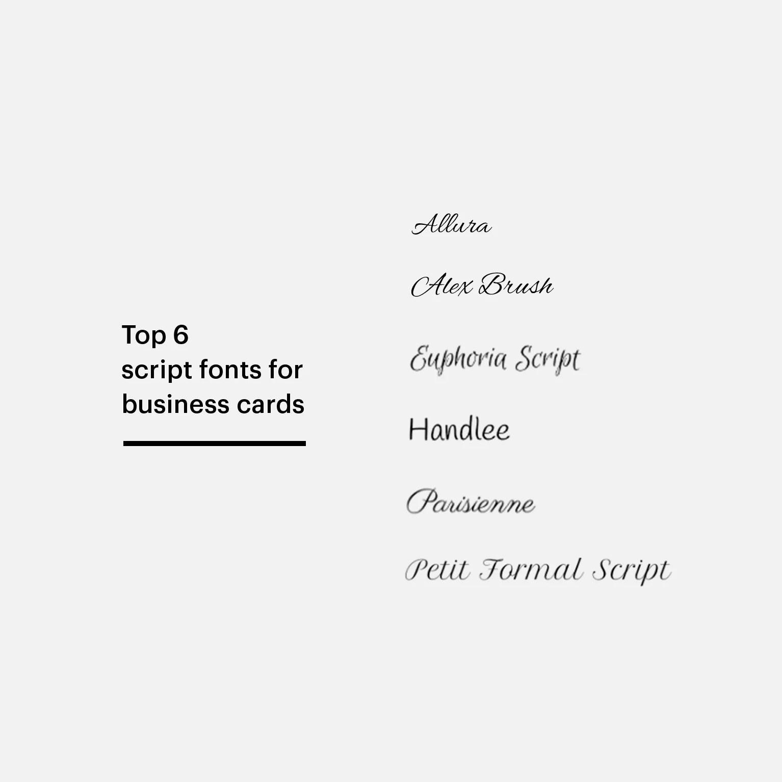
Where to use script fonts
Script fonts are typefaces that convey a human touch, like flowing cursive strokes and handwritten-style calligraphy. Script fonts work great for invitations, greeting cards, headlines or one-off personal messages. Classic, flowing scripts usually achieve an elegant look, while rounder ones create a sense of fun.
A scripted typeface can be great for catching attention, but make sure your message is still legible. Don’t use script for long sections of text, as they’re difficult to read at smaller font sizes. If you’re committed to using a script font on your business card, incorporate it into second-tier copy, like your tagline or motto.
How to combine fonts on your business card
When designing your business card, narrow your selection to two fonts. Create a visual hierarchy and decide which information should be most prominent – probably your name, or the name of your small business. The rest of the information, like your contact details and social handles, can appear in a smaller size or a different font.
Here are some more tips for using fonts on your business card:
- Pair a script or serif font with a sans-serif.
- Avoid pairing fonts that look similar.
- Use different weights (bold, regular, italic) of the same font to create contrast.
- Don’t use more than three font sizes on your business card. (Two is ideal!)
- Create contrast between text and background on your design…you want every text field to stand out.
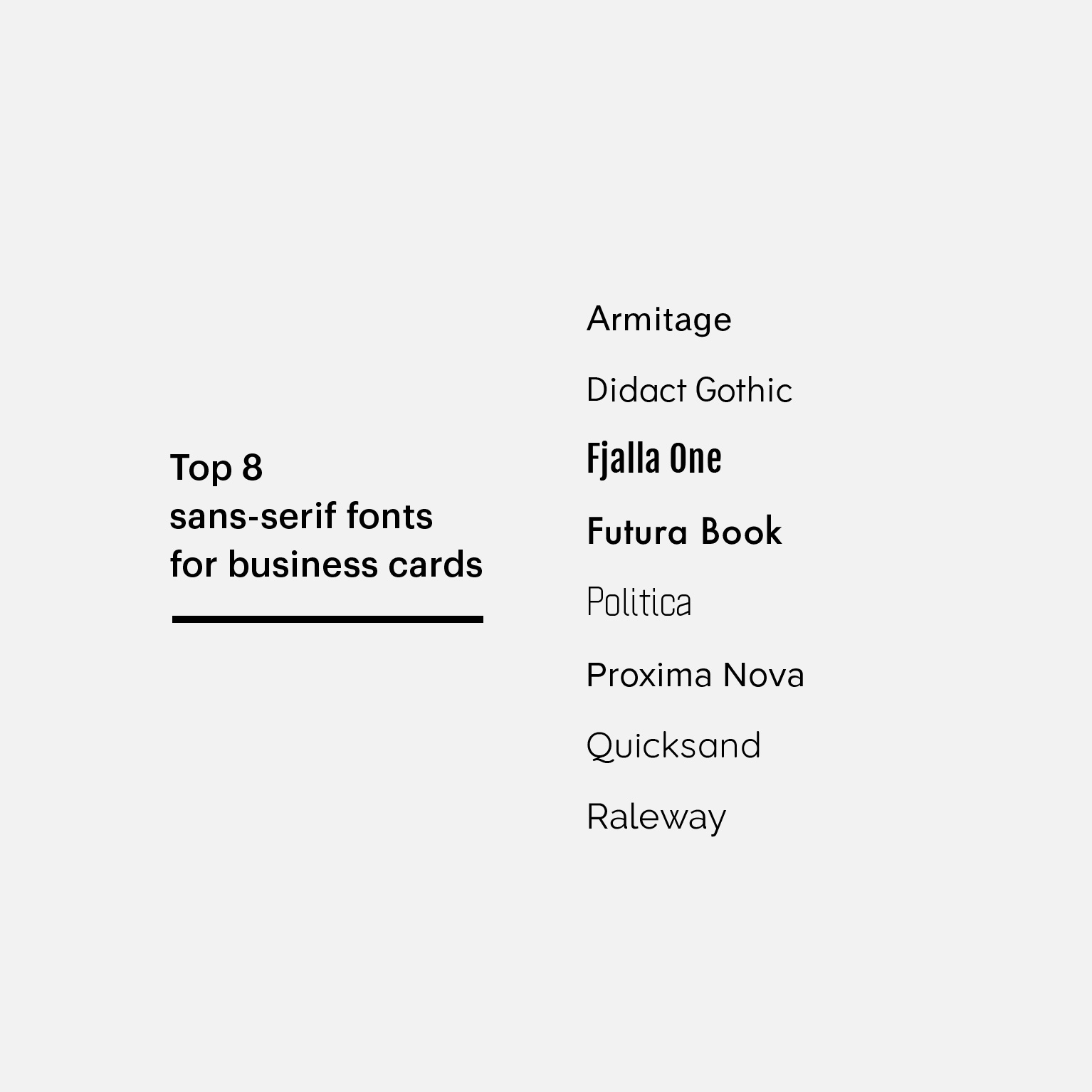
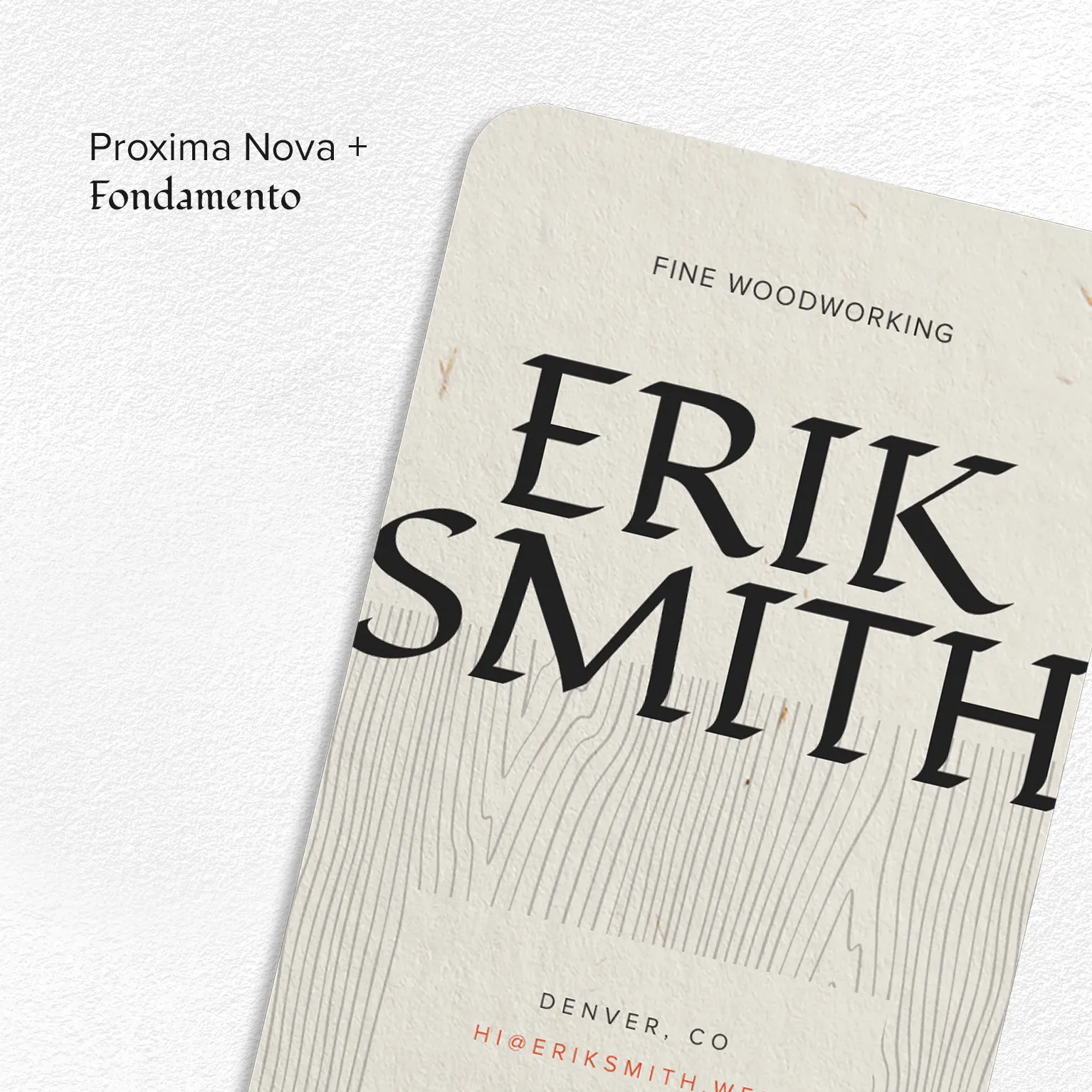
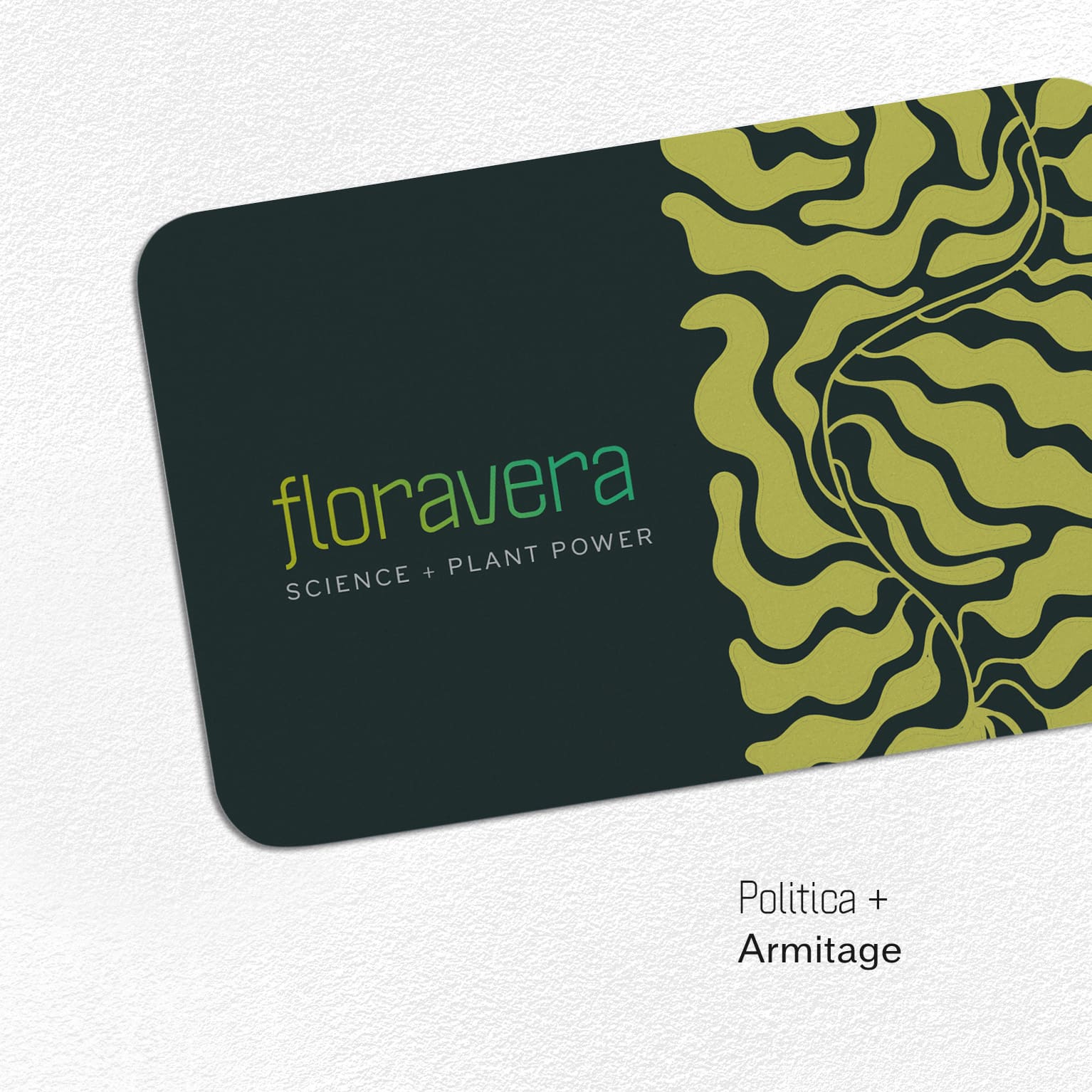
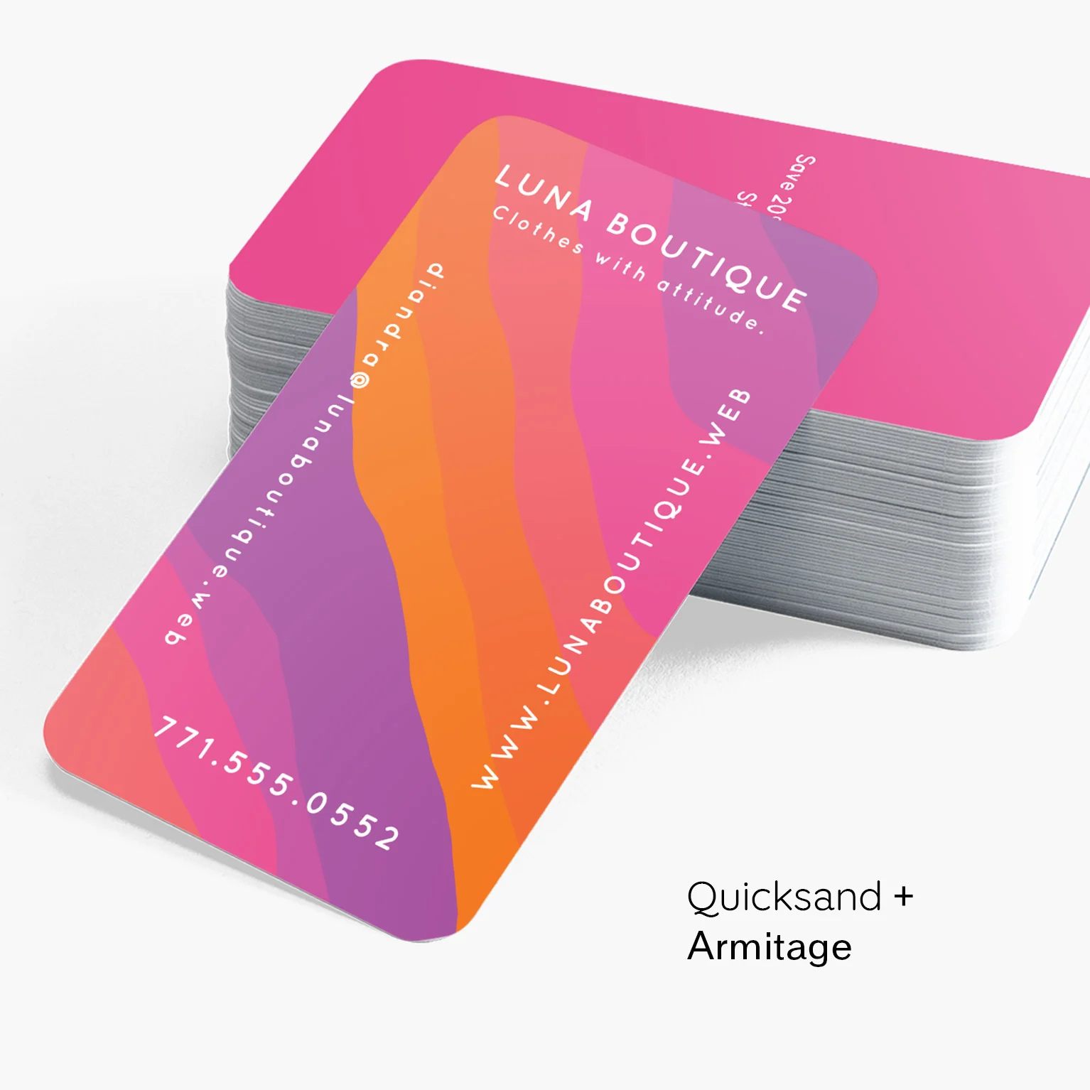
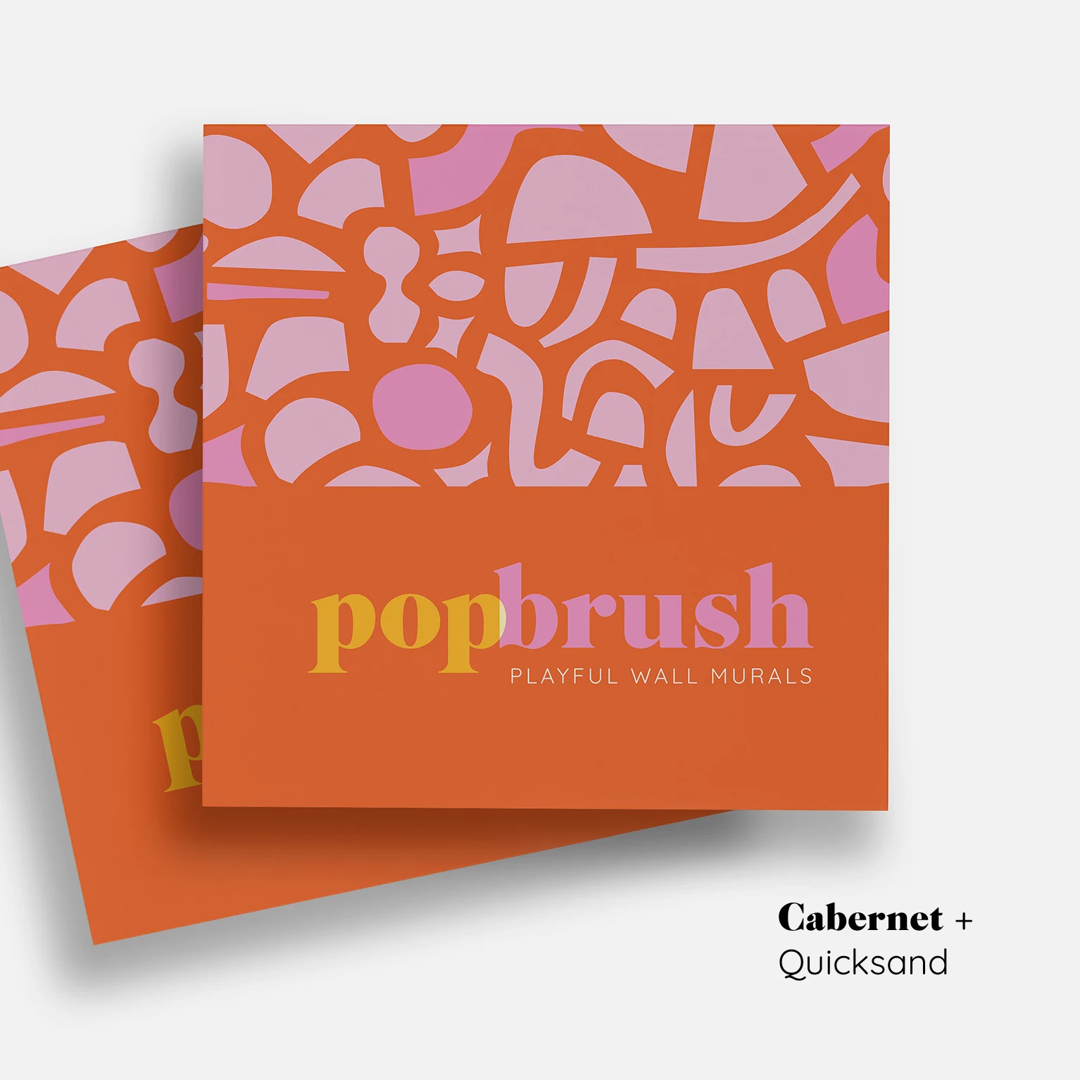
4 font combinations to inspire your next business card
Business card font size: Best practices
In typography, point size (pt) is the standard unit of measurement when measuring letters in a design. Prominent business card information, like your company name or full name, should be between 10pt-16pt, depending on how much space you have available.
The size of your secondary text (like your job title, email address, phone number or Instagram handle) should still be visible and legible, but should look noticeably smaller than the primary text. The minimum business card font size you should use on our templates is 8pt, but you can go a bit larger if you have space. Keep in mind that certain fonts can appear smaller than others even at the same point size. And be especially careful with script and serif fonts at low sizes. If you do have to include small print, use a sans-serif font for optimal legibility.